Until recently, Baltic Circle's visual identity changed completely each year. New logos, colour palettes and sticker packs were something sharp-eyed audience members may have anticipated almost as much as the performances themselves, with graphic design treated as an extension of the festival’s curatorial efforts rather than a fixed brand asset.
A commitment to supporting local and experimental design talent landed Hanna Parry, the festival’s artistic director, the client of the year award at the Vuoden Huiput competition in 2020. While that commitment is still ongoing, shrunken budgets have changed the picture for us. Faced with significant cuts to funding, the search began for a visual system that didn’t have to start from scratch each year, but still left space for seasonal shifts and a designer’s imagination.
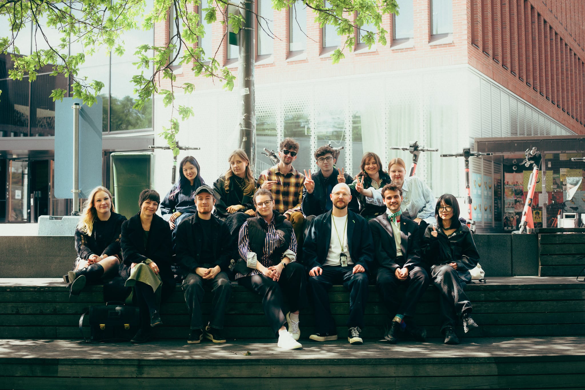
That spirit is part of what shaped a pilot studio course run with Aalto University’s MA Visual Communication Design major in spring 2026. Aptly titled “Experimental Visual Identity”, the program brought together a cohort of emerging designers with the Baltic Circle team to explore what a new kind of dual-identity system might look like.
The course was facilitated by Tuomas Kortteinen, a designer and lecturer at Aalto University with his own history with the festival (Tuomas undertook identity work with Baltic Circle way back in 2015 with the design collective GRMMXI). This time he returned to the table from the other side of the brief:
“It was a really positive experience. For me personally and for the Visual Communication Design major as a whole,” he says. “Having real-world cases as course work has been a major request among MA students. Now we have a strong pilot example we can point to. Hopefully it’s the first of many such collaborations.”
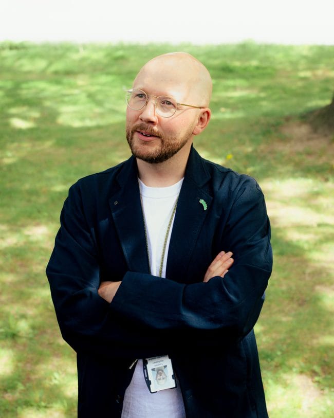
Photo: Helmi DeMaxi
The project-based course resulted in a multitude of bold directions for Baltic Circle’s visual DNA. Approaches ranged from identity systems that both hibernated and bloomed with the changing seasons, to ones inspired by scenography, scaffolding, and collaged physical media. Ultimately, the festival trusted the vision of designer duo Siiri Rajalin and Zhenzhen Guo, who describe creating a flexible yet reproducible visual identity as a chance to ‘honor such a legendary graphic design client while bringing something new to its table’.
“We turned the traditionally untouchable logo into a variable shape without losing its recognizability,” shares Zhenzhen, mentioning that a custom typeface alongside new typographic rules “could anchor all these quirky elements within the wider visual system of the festival.”
“We decided to base our system on a distinctive, stretchy logo marque. Seasonal visuals may grow within or on top of it,” adds Siiri, “You’ll see what that means come festival season!”
A new look is always exciting, but this time around, our team is looking forward to something that will keep growing older with us.
Baltic Circle would like to extend our warm gratitude to all graphic designers who took part in the studio course, as well as all those who have helped shape the festival’s identity in the past. Special thanks are also in place for the talented Katri Astala and Iisa Pappi, who have led the charge on Baltic Circle’s visual world in the most recent years.
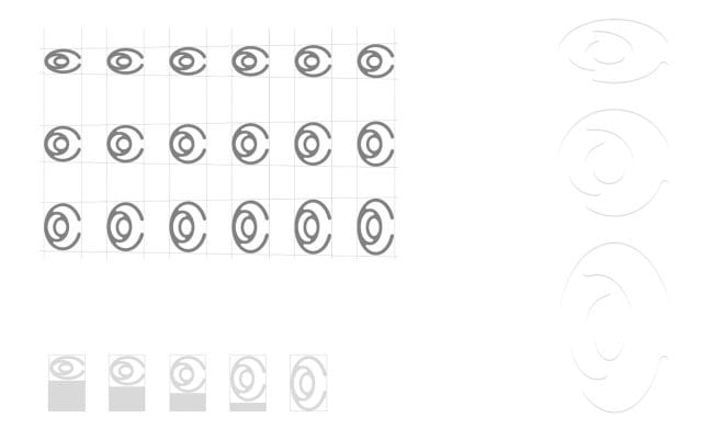
Photo: Zhenzhen Guo & Siiri Rajalin